Summary
- Avengers: Doomsday received an upgraded logo, which was unveiled on Wednesday.
- The new logo was met with disapproval from fans, and it was seen as a downgrade compared to the original.
- Fans prefer the original logo due to its worn-out, chaotic appearance, giving it a more serious tone.
The film “Avengers: Doomsday” received an update after the significant announcement by Marvel Studios, and many have spotted a fresh new logo on it.
At San Deigo Comic-Con in July 2024, Marvel officially announced “Avengers: Doomsday.” During this event, they also revealed the new movie’s official logo, signifying a shift in direction. Originally, the next Avengers film was supposed to be “Avengers: The Kang Dynasty,” but its lead actor, Jonathan Majors, became entangled in a legal dispute, forcing Marvel Studios to part ways with him. This incident led the studio to alter their plans and they moved towards “Doomsday.” Robert Downey Jr., who played one of the original Avengers as Iron Man, will return as Doctor Doom in this film. Remarkably, Downey Jr.’s character, Tony Stark, died in “Avengers: Endgame” (2019) by sacrificing himself to save the universe. The recent announcement about the film, made on Wednesday, also featured a slightly modified logo, which some fans have expressed disapproval over.
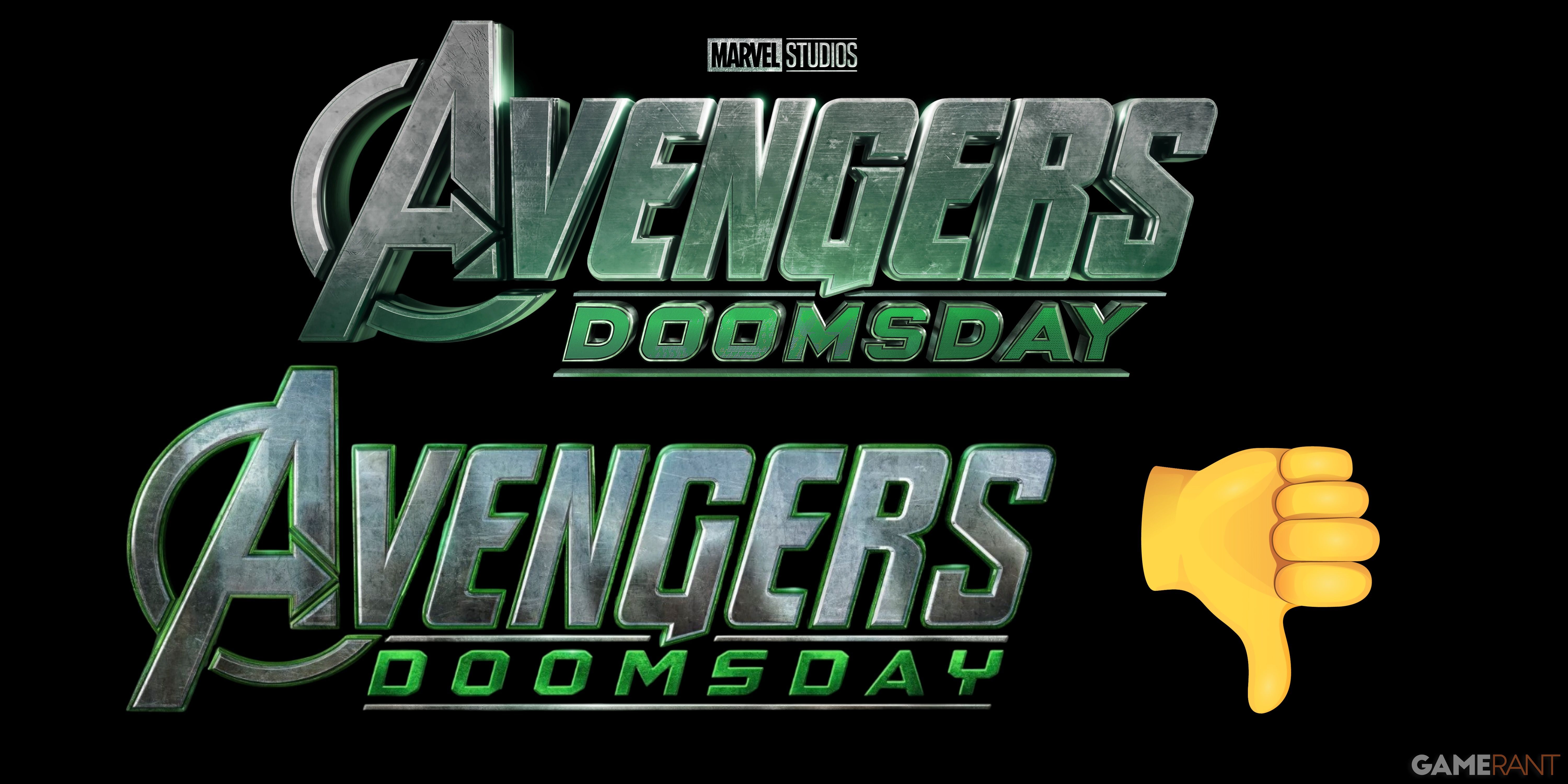
The initial design for “Avengers: Doomsday” showcases the word “Avengers” prominently in bold, metallic letters with a slightly worn appearance and deliberate scratches on each character. The classic shape of the letter ‘A’ is maintained. Beneath it lies the word “Doomsday,” written in sharp, jagged green script. The Marvel Studios logo, in black and white tones, can be found at the top. This logo employs a mix of green, silver, black, and white hues, contributing to an apocalyptic atmosphere. The font’s shadowy and textured style accentuates its dark theme.
In contrast, the updated logo introduces a greenish halo around each letter, potentially alluding to Doctor Doom’s influence. The scratches visible in the original design have been removed. A striking difference is the “Doomsday” text, now written using a fresh font with a glowing effect surrounding the words for added emphasis. As before, the Marvel Studios logo remains above the text; however, this time, it appears in its vibrant colors — white and red.
The revamped logo for “Avengers: Doomsday” sparked controversy among many fans, as they showed a strong preference for the original design. Many found the new look disappointing, even going so far as to call it a step back compared to the first one. Some playfully suggested that the design resembled work from an inexperienced Canva user. Others felt that the updated logo gave off a video game vibe, which didn’t sit well with them. All in all, fans seemed displeased with the new version for various reasons.
At first glance, the old and revamped Avengers: Doomsday emblems seem quite similar. But upon closer inspection, the original one appears worn, with noticeable scratches that suggest devastation or turmoil. Its gritty texture and limited color palette of black, silver, white, and muted green give it a dull look, yet its emotional impact is far from subdued. On the flip side, the refreshed logo boasts vibrant colors, such as the typical red and white of Marvel Studios, with “Avengers” outlined in radiant green and wider spacing between the letters in “Doomsday.” The new design is sleeker, but some may argue that the weathered first logo carries more narratives, which could appeal to many fans. However, preferences for the logo are subjective, as opinions vary widely – while some dislike it, others might approve of it. In the end, it’s all about personal taste!
Avengers: Doomsday will hit theaters on May 1, 2026.
Read More
- Top 8 UFC 5 Perks Every Fighter Should Use
- Unlock the Magic: New Arcane Blind Box Collection from POP MART and Riot Games!
- Unaware Atelier Master: New Trailer Reveals April 2025 Fantasy Adventure!
- How to Reach 80,000M in Dead Rails
- How to Unlock the Mines in Cookie Run: Kingdom
- Unlock Roslit Bay’s Bestiary: Fisch Fishing Guide
- Unlock the Best Ending in Lost Records: Bloom & Rage by Calming Autumn’s Breakdown!
- Toei Animation’s Controversial Change to Sanji’s Fight in One Piece Episode 1124
- REPO: How To Fix Client Timeout
- Unleash Hell: Top10 Most Demanding Bosses in The First Berserker: Khazan
2025-03-27 21:02