Summary
- Box art isn’t just for show; it sets the tone for the entire gaming experience.
- Covers like Limbo’s evoke emotion and set the atmosphere without relying on gore.
- Iconic game covers like Kingdom Hearts & Doom establish themes and expectations for players.
The artwork on a game box serves a purpose beyond merely marketing the product. At its finest, it functions as a sneak peek into the entire gaming experience – offering glimpses of the world, ambiance, or emotions that await players. Some covers are attention-grabbing with their chaos and noise, while others entice through an enigmatic quietude or somber elegance.
Furthermore, some covers continue to resonate even after the game has ended. These are the type of designs that players remember for years, finding them just as captivating as if they were hanging in an art gallery instead of sitting on a bookshelf.
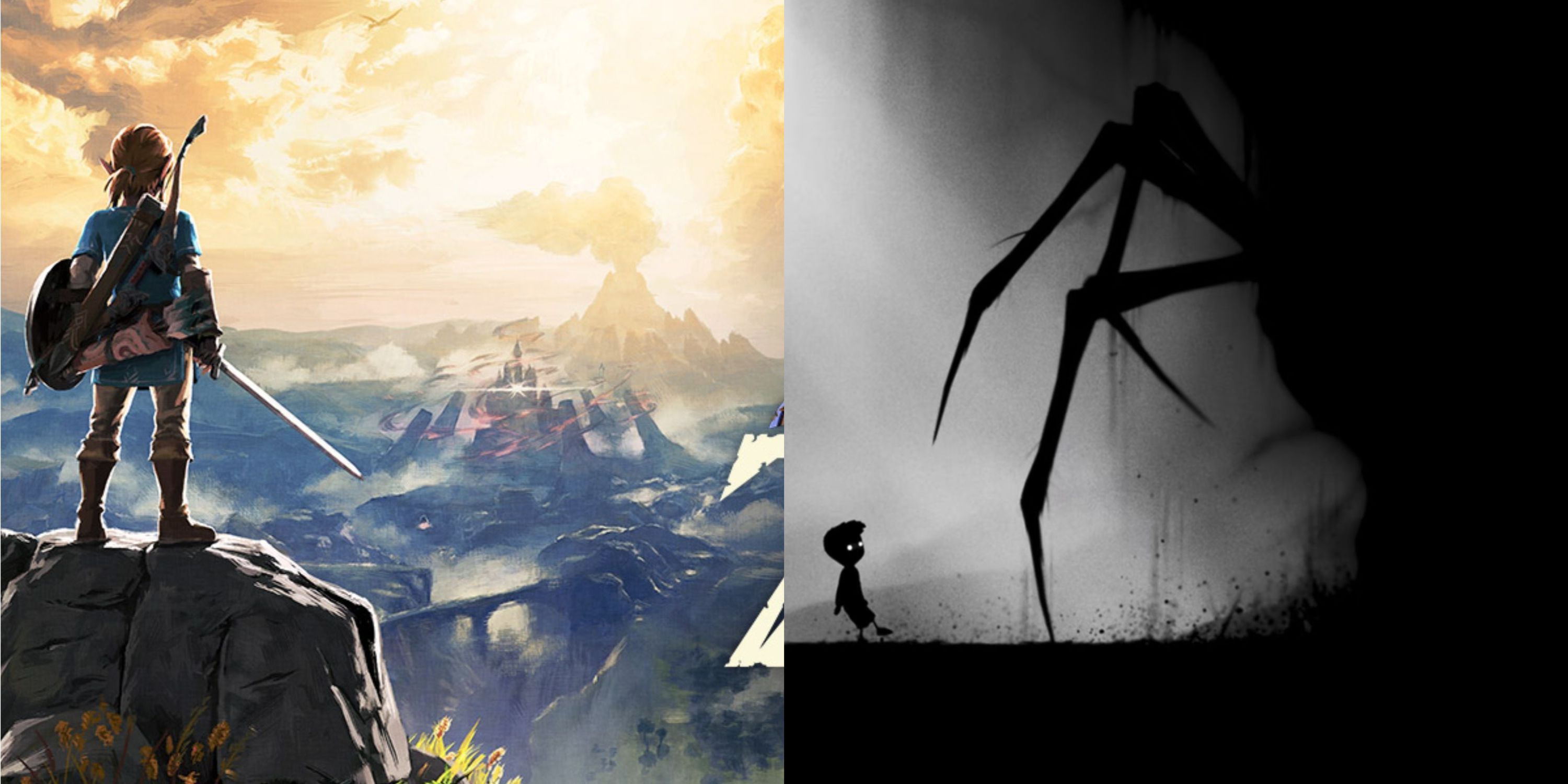
6. Limbo
A Lone Boy, A Forest, And Something With Too Many Legs
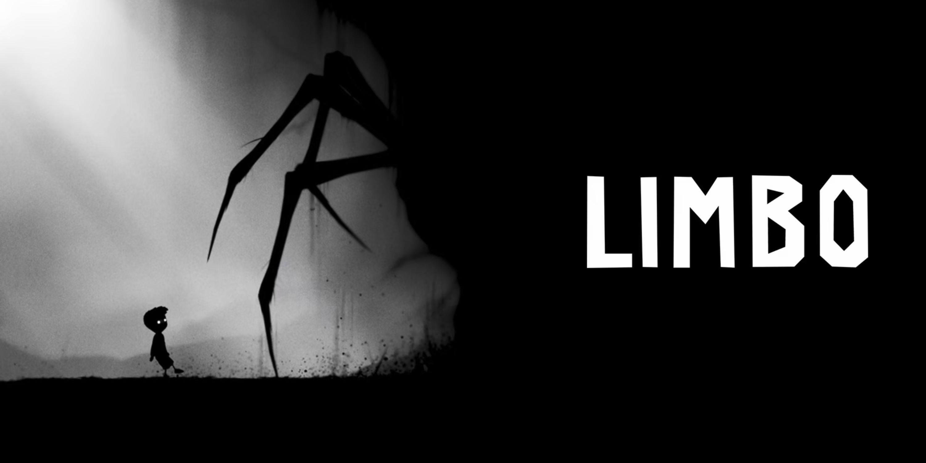
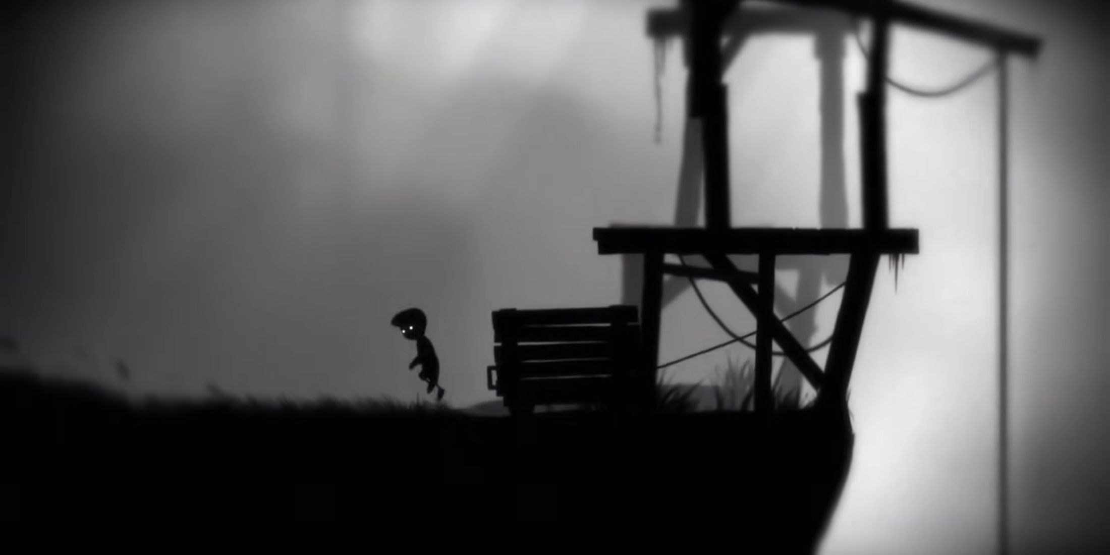
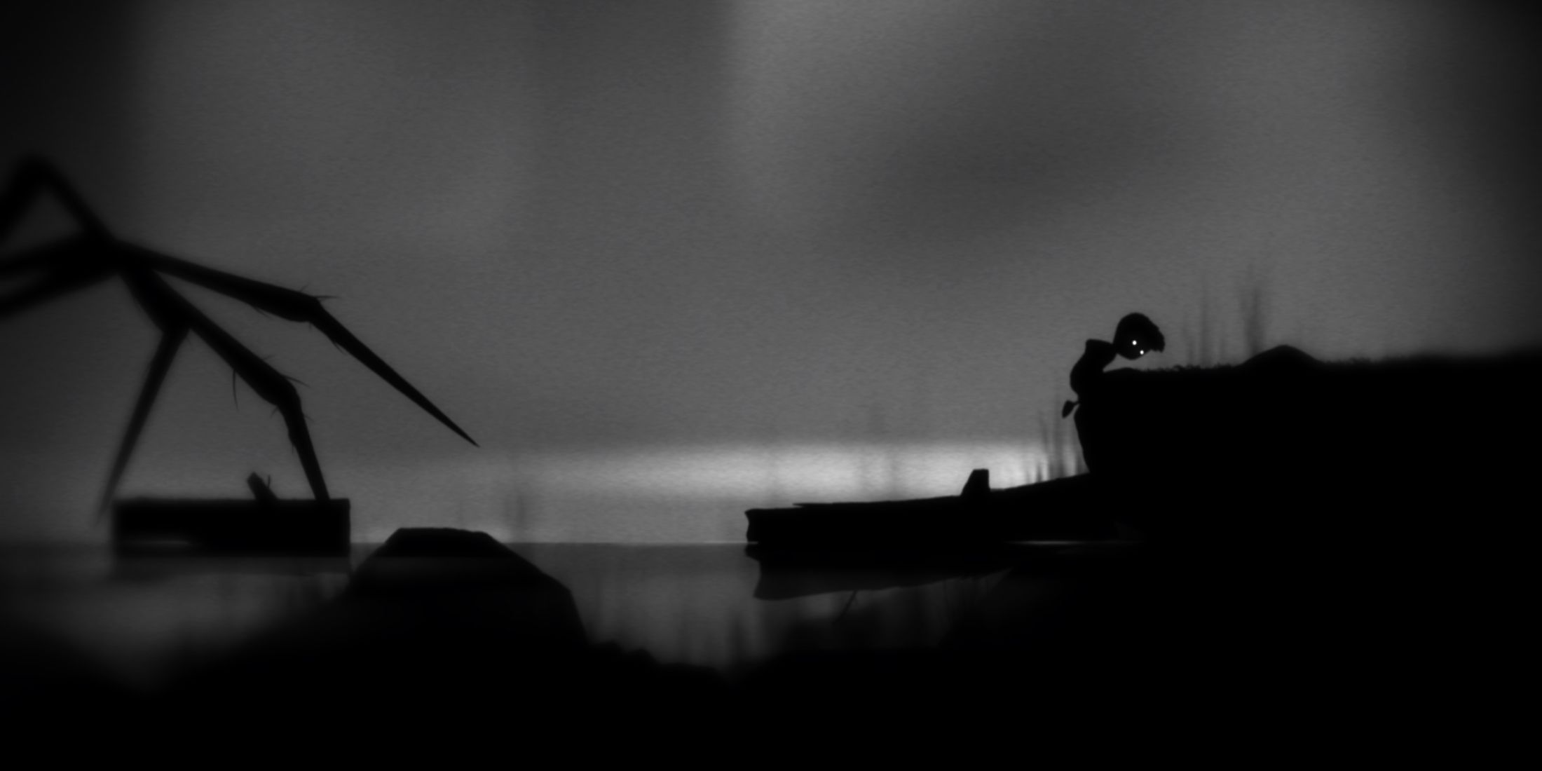
The cover for the game Limbo doesn’t shout loudly; instead, it whispers. It’s a subdued, monochrome background with only a silhouette of a young boy and the long, eerie legs of a spider stretching from the darkness towards him. In every way, it’s minimal, and that’s precisely why it is effective.
In the world of Limbo, I found this spider to be one of the first and eeriest challenges I faced as a player. Its presence on the cover seems like a foreboding omen. However, the true brilliance of this artwork isn’t just in its unsettling nature, but also in its emotional impact. It manages to instill dread without resorting to graphic violence or gore. Instead, it relies on clever use of shapes and lighting to create an atmosphere of unease. This sets the tone for Limbo’s atmospheric puzzle-platforming experience, where death is always a looming possibility, and safety is more of a dream than a reality.
When Limbo was released in 2010, its distinctive, surreal visuals immediately set it apart from other games at the time. Since then, this game has been frequently mentioned as a trailblazer for how indie titles have changed perceptions about the types of stories that can be told through video games. Even before any puzzles were solved, Limbo’s cover art paved the way for this change in perspective.
5. Kingdom Hearts
Disney Meets Final Fantasy Under A Moon That Looks Like A Heart

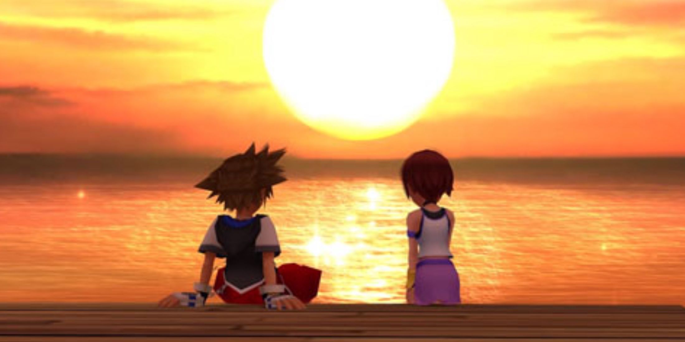
The original Kingdom Hearts cover has a nostalgic and somewhat melancholic feel to it. On a gothic-style tower, characters Sora, Kairi, Riku, Donald, and Goofy are sitting together, gazing at a heart-shaped moon in a cloudy sky. Unlike many action-packed posters, this image resonates deeply because of what it symbolizes: camaraderie, yearning, and the unique mix of Final Fantasy aesthetics and Disney magic that only Kingdom Hearts can create.
The crescent moon with a heart design, known as Kingdom Hearts in the storyline, serves a significant role beyond merely enhancing the game’s visual appeal. It plays a crucial part in the narrative, symbolizing the balance between light and darkness within characters, worlds, and emotions. This celestial body, suspended above the characters like a luminous enigma, subtly weaves the theme of seeking connections into the very fabric of the game’s art.
The design of Tetsuya Nomura, the cover art intricately positions each character separately within the picture, mirroring their emotional estrangement and escalating conflicts within the narrative. Riku’s nonchalant posture, Sora’s casual slouch, and Kairi’s contemplative gaze convey far more than words ever could. It is uncommon to find a game cover that encapsulates the atmosphere, backstory, and character progressions in just one still image—yet Kingdom Hearts manages to achieve this remarkable feat.
4. Resident Evil 4
Chainsaws Don’t Belong In Forests… Or Do They?
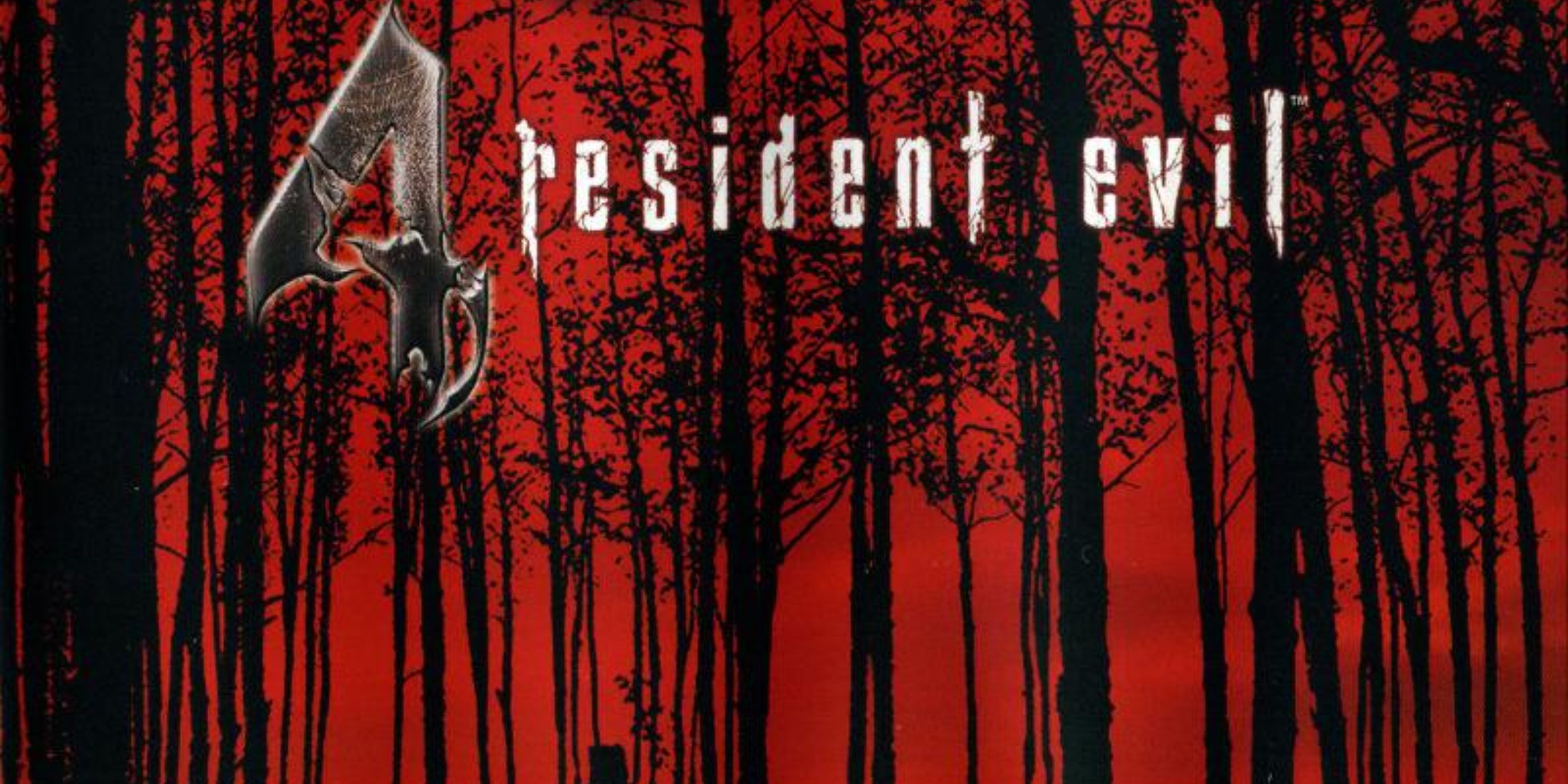
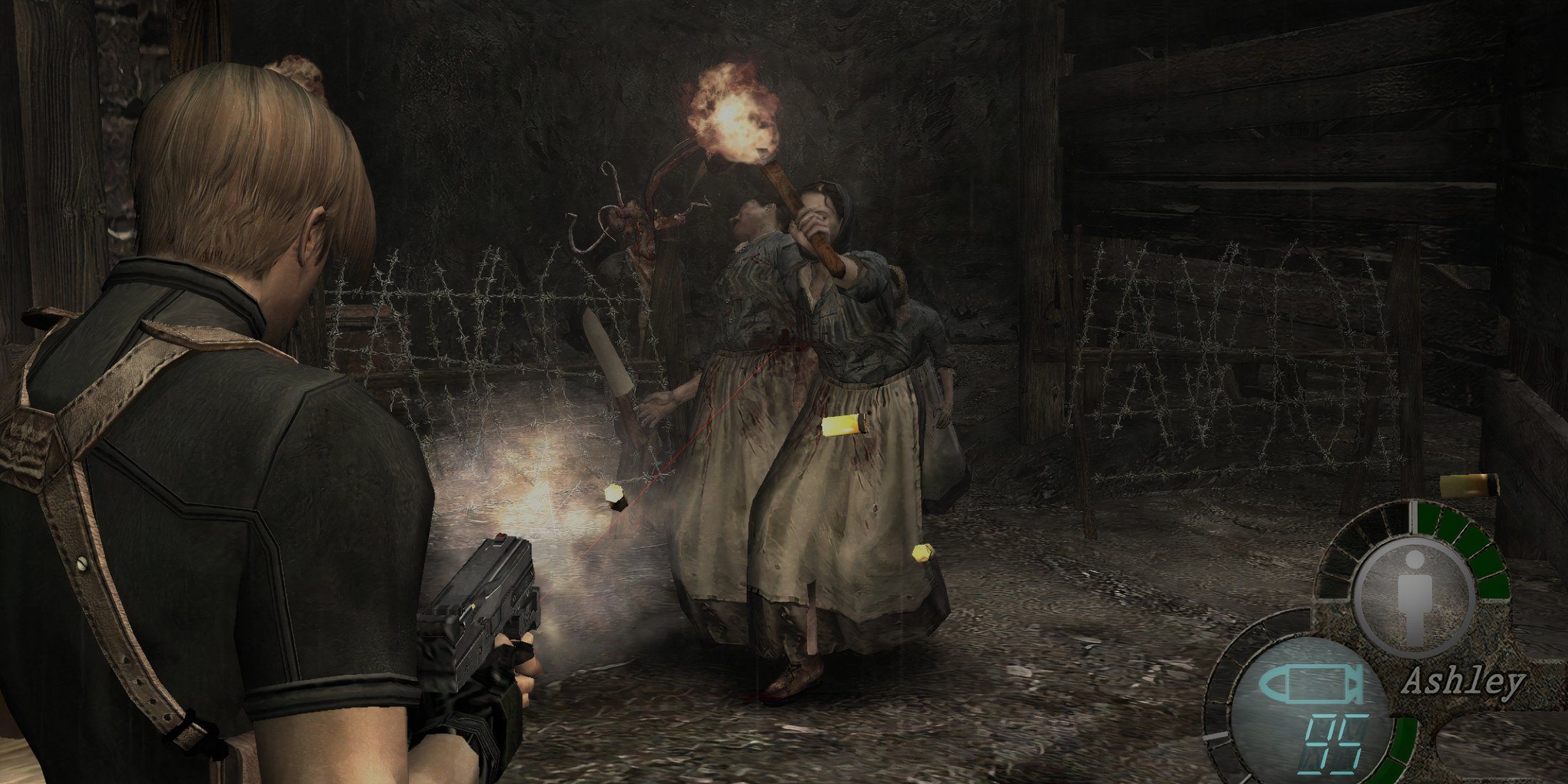
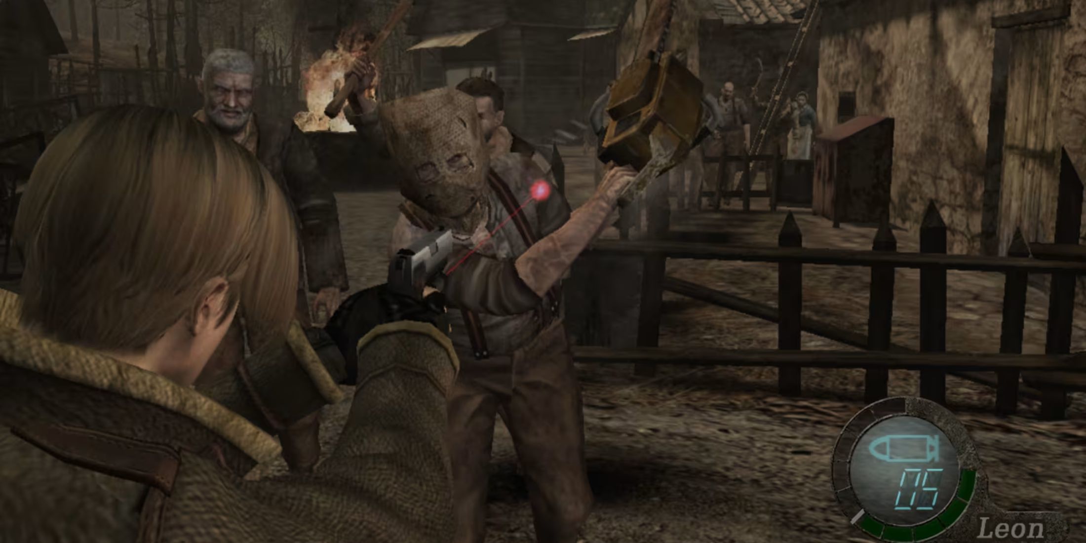
Among all the covers for “Resident Evil 4” distributed across different platforms and regions, there is one that stands out as particularly eerie: the one tinted red, featuring ominous shadows of trees and a silhouette of a figure brandishing a chainsaw, hidden in the distance. Unlike others, this cover doesn’t show Leon Kennedy or hordes of zombies attacking the viewer. Instead, it subtly hints at an unseen presence or danger lurking.
This cover is remarkably subtle considering it belongs to a series famous for its frenetic action. Yet, the quiet apprehension suggests the transformation of Resident Evil 4 from conventional survival horror into something more psychologically intense. Even bright daylight could not ensure security in this game. The man with the chainsaw in the backdrop isn’t just a common danger; he represents the Dr. Salvador enemy type, inflicting some of the game’s most gruesome deaths and haunting players as soon as they heard that roaring sound.
The red tint increases an unsettling feeling, causing the trees to appear drenched in blood instead of basking in sunset light. Moreover, the deliberately expansive and vacant areas draw the viewer’s focus directly to the enigmatic figure, creating the impression that he is observing you. This demonstrates masterful application of subtle horror aesthetics at its peak.
3. Red Dead Redemption
A Cowboy With A Gun And A Look That Says “Try Me”
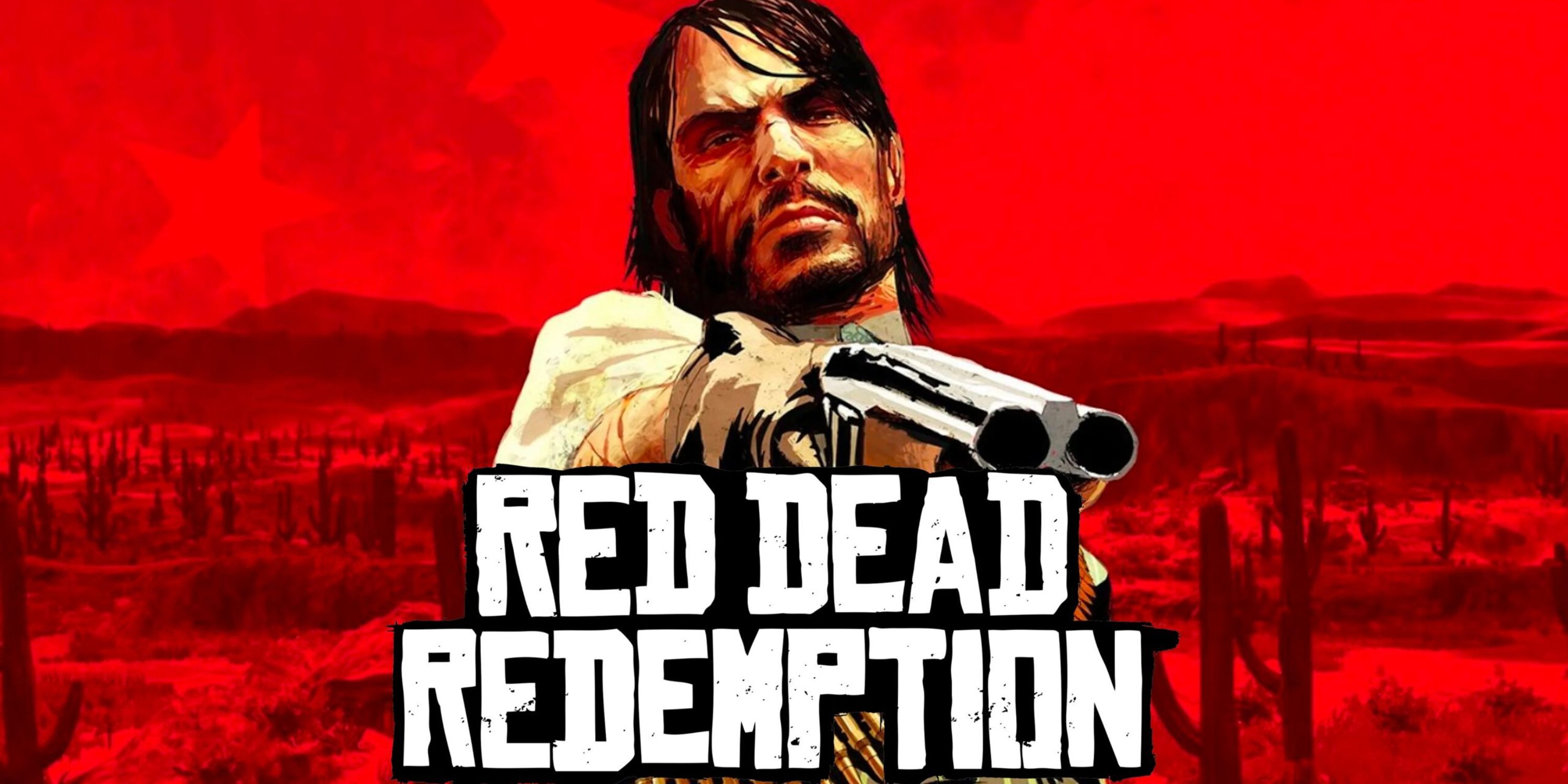
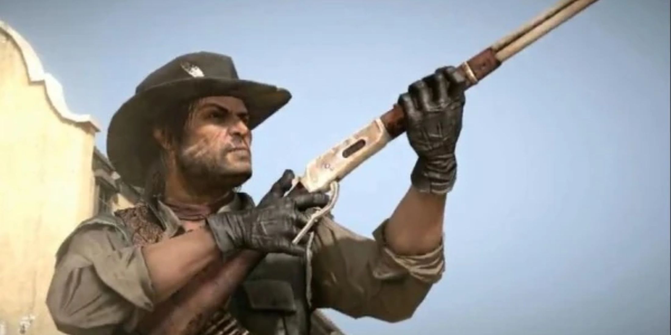
John Marston is shown boldly, with a short-barreled shotgun aimed directly at the audience, and an expression that clearly indicates he’s not open to discussion. The overall color scheme of red and beige gives off a gritty, harsh, and perilous vibe, mirroring the unforgiving nature of the frontier.
The artwork carries a sense reminiscent of an old movie poster, yet bearing enough dirt and roughness to maintain its authenticity within the realm of Red Dead Redemption. Those who kept tabs on Rockstar’s track record were well aware that this wasn’t going to be a tale of stereotypical cowboys or outlaws. Instead, it was about redemption, brutality, and the demise of an era. From the very beginning, Marston, with his worn-out visage and weary eyes, bore the burden that players felt even before they initiated their first save game.
During the pre-release period, this art piece was prominently displayed on buses, billboards, and shop windows. Its impact was significant due to its straightforwardness. It lacked complex symbolism or distant vistas; instead, it simply portrayed a man with a gun. Remarkably, this simple depiction was more than enough.
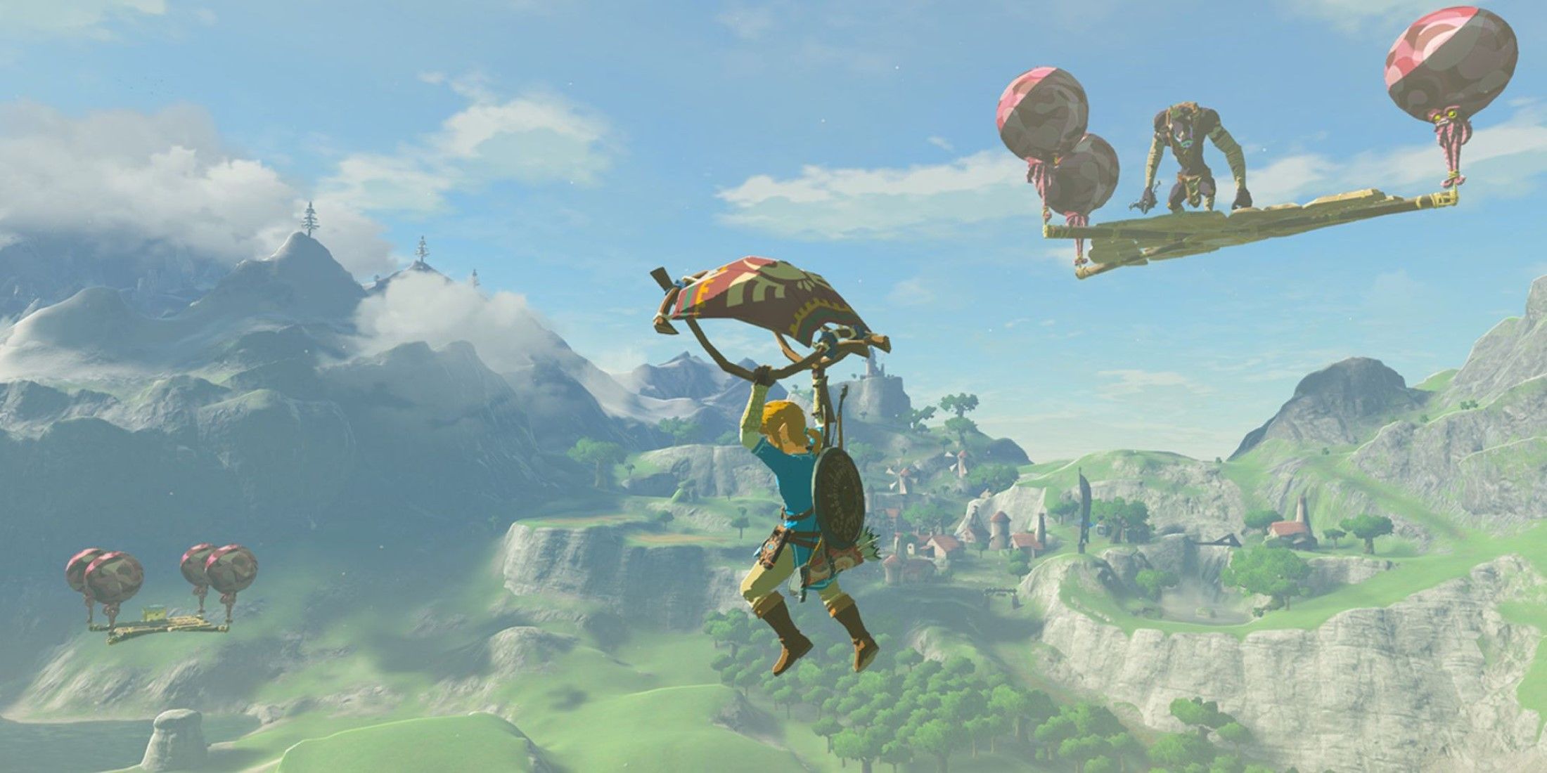
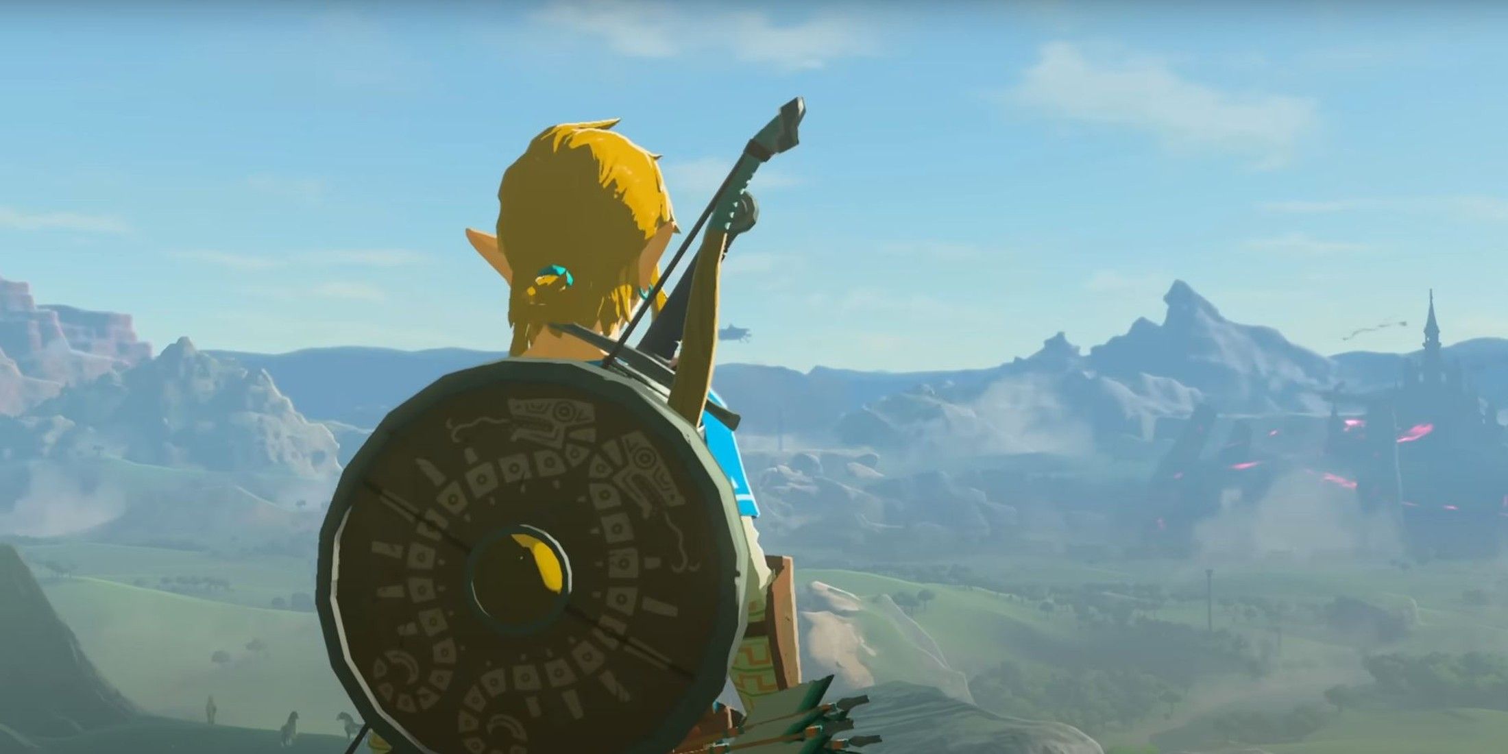
2. The Legend of Zelda: Breath Of The Wild
A View So Beautiful, Players Forgot Ganon Was Still Alive
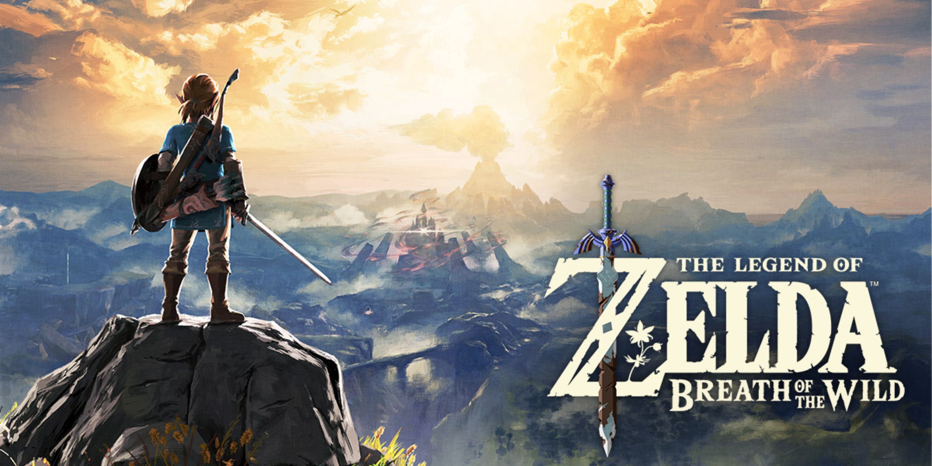
Standing on a cliff’s edge, one gazes upon an expansive Hyrule, stretching endlessly beyond the horizon under the soft morning glow. It’s not merely picturesque—it’s inspiring. This moment marks the threshold of an adventure, a sight so captivating that it stirs within players a desire to grasp a sword and charge towards the distant mountains.
The unique appeal of this cover lies in its reflection of the game’s play philosophy, which emphasizes freedom, exploration, and the tranquil splendor of nature – key elements that define Breath of the Wild. Unlike many other games, it presents a serene landscape devoid of adversaries or ominous threats. Instead, it offers a boy armed with a sword, standing amidst an expansive view that seems to stretch endlessly.
As a devoted fan, I can’t help but notice the striking similarity between the stance Link assumes – gazing back at us while taking in the landscape – and the view players initially encounter during the game’s Great Plateau introduction. This is more than just a clever wink; it’s a hint at what lies ahead. The clouds, the vibrant colors, the distant volcano, and even the way sunlight filters through the sky all whisper of a game that’s not about battling but about discovery – uncovering shrines, unearthing memories, solving mysteries, and perhaps finding some tranquility along the journey.
1. Doom
When Doom Guy Was The Only Thing Between Hell And Earth
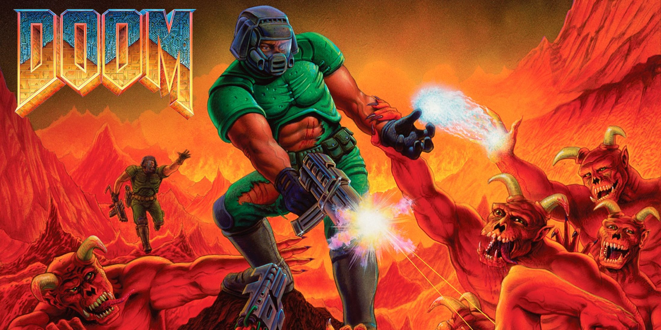

The iconic cover of the original Doom game is legendary in the metal music world. On it, Doom Guy is prominently displayed, powerfully firing at swarms of demons while perched on a pile of dead bodies, his muscles taut and unleashing a whirlwind of bullets. This image encapsulates raw masculinity, fear, and the absurd in one powerful snapshot.
Don Ivan Punchatz, despite never having played video games, found inspiration for this image from pulp science fiction and horror comics of the 70s and 80s. This artwork didn’t just have a cool appearance; it established a tone. The game wasn’t about intricate storylines or gentle development—it was all about battling through Hell with a shotgun and a stubborn attitude.
The arrangement is delightfully disorderly. Despite being encircled, Doom Guy remains unfazed. This wasn’t an ordinary battle; it was a conflict whose loss could cost humanity everything. And after all these years, that game box art continues to tower as one of gaming’s most enduring symbols of power fantasy.
Read More
- Best Awakened Hollyberry Build In Cookie Run Kingdom
- AI16Z PREDICTION. AI16Z cryptocurrency
- Tainted Grail the Fall of Avalon: Should You Turn in Vidar?
- Best Mage Skills in Tainted Grail: The Fall of Avalon
- Nintendo Offers Higher Margins to Japanese Retailers in Switch 2 Push
- Top 8 UFC 5 Perks Every Fighter Should Use
- Nintendo Switch 2 Confirms Important Child Safety Feature
- Nintendo May Be Struggling to Meet Switch 2 Demand in Japan
- Nintendo Dismisses Report On Switch 2 Retailer Profit Margins
- Nvidia Reports Record Q1 Revenue
2025-04-23 07:40