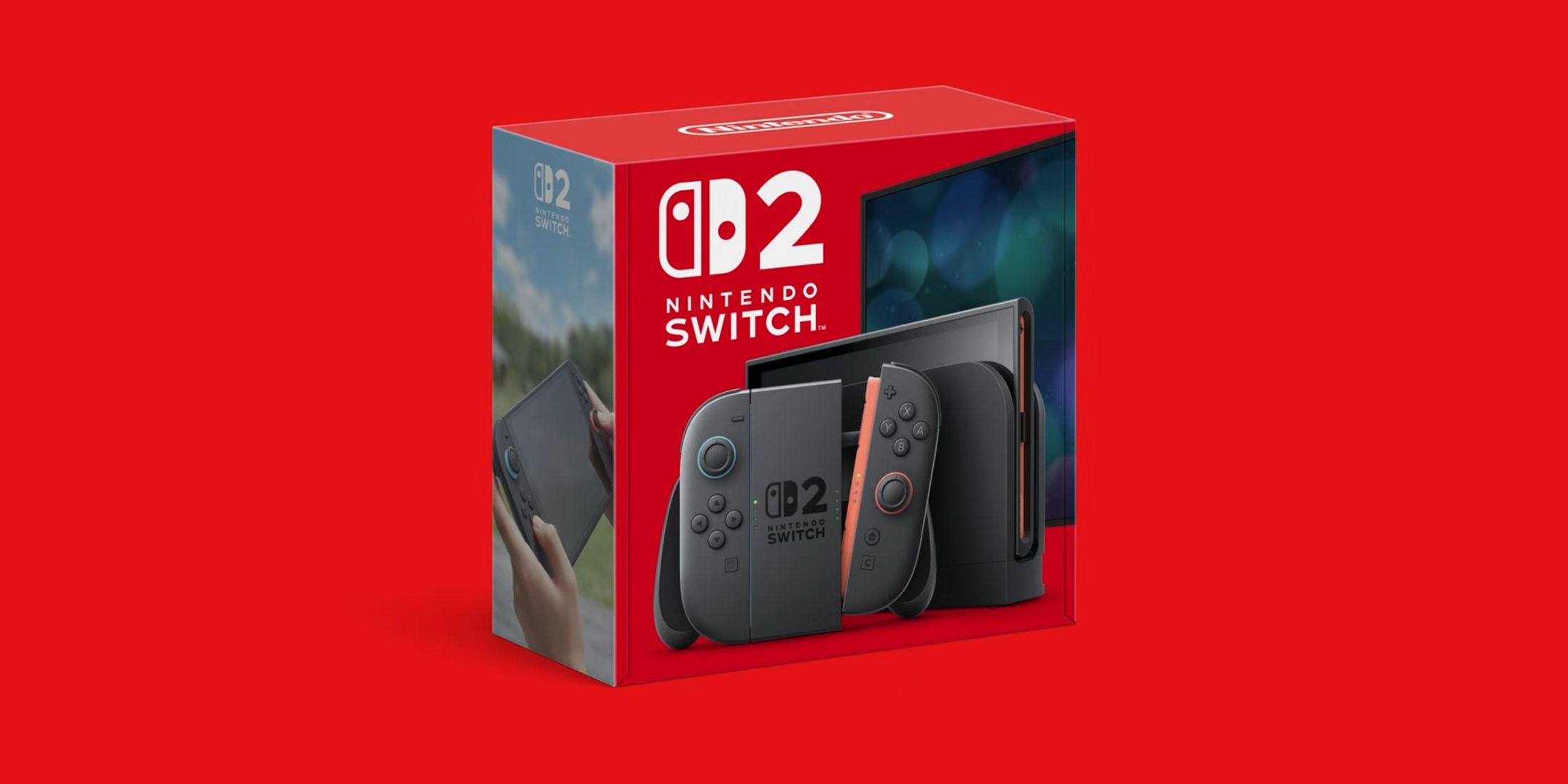
At long last, the anticipated details and gaming library of the Nintendo Switch 2 have been unveiled, sparking excitement among gamers worldwide as they catch their first glimpse of Nintendo’s upcoming console/handheld device hybrid. The successful era in Nintendo’s history that began with the launch of the original Nintendo Switch in 2017 propels them directly towards the June 2025 release of the Nintendo Switch 2. Although the initial lineup for the Nintendo Switch 2 appears modest at present, the games announced for the system hold great promise, particularly the collection of first-party titles that Nintendo presented during its April Direct broadcast.
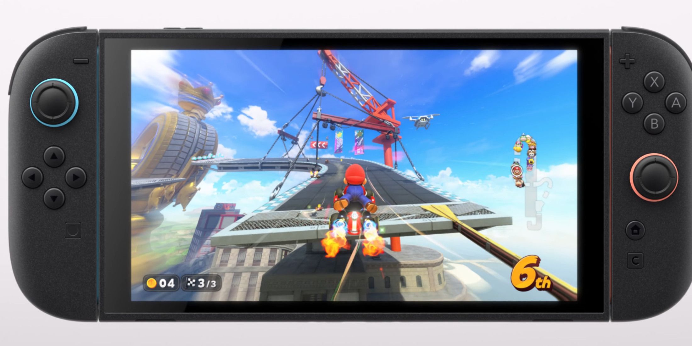
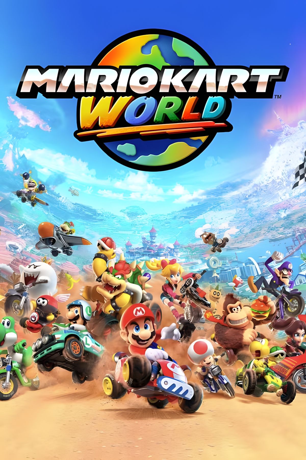
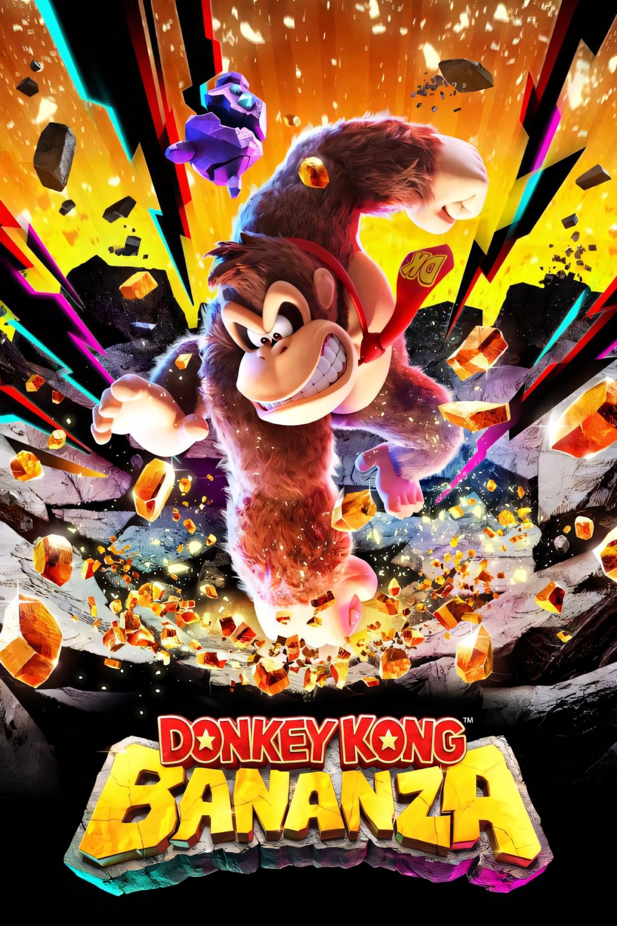
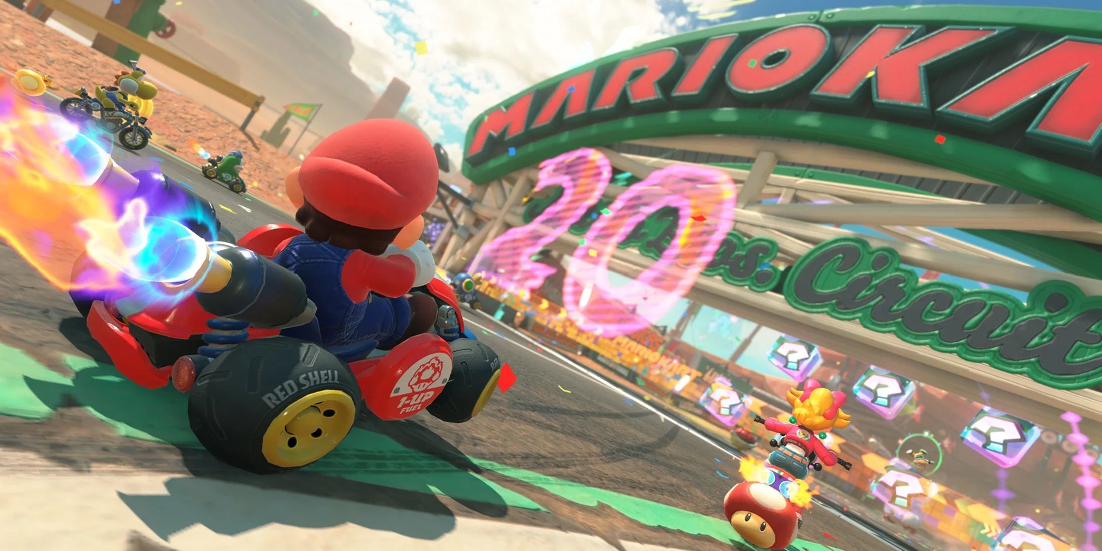
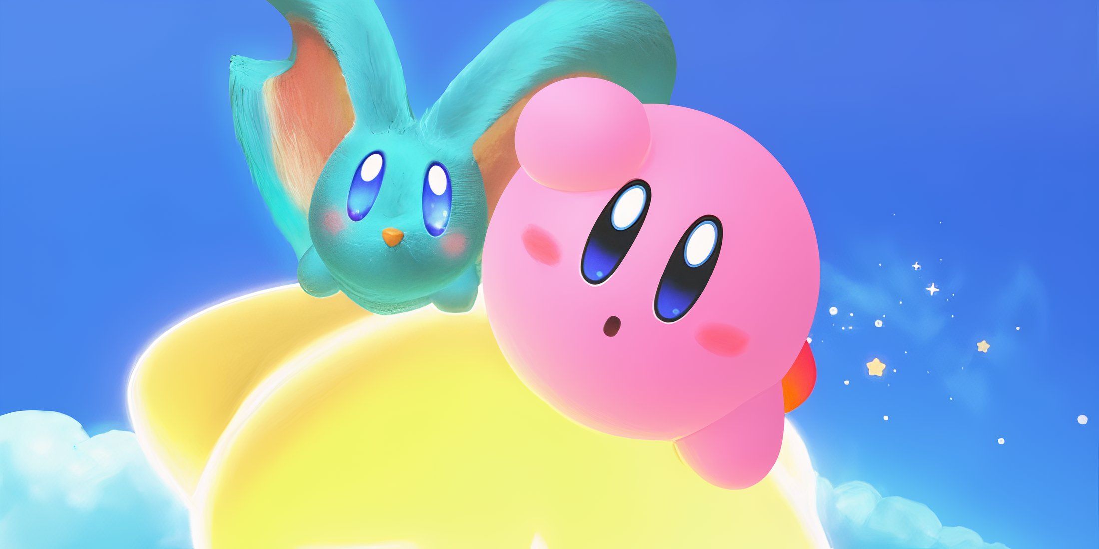
Prominent among the titles showcased are “Mario Kart World” and “Donkey Kong Bananza,” with Nintendo placing emphasis on both. These games are slated for release within the launch window of the Nintendo Switch 2, and appear to be the primary exclusives Nintendo intends to leverage in selling the console. Additional titles, such as “Hyrule Warriors: Age of Imprisonment” and the unexpected “Kirby Air Riders,” are set to arrive before the end of 2025. Nintendo has already secured a robust third-party offering to complement these games. The main drawback for the Switch 2’s game library, other than its escalating price points, is how it will appear on a shelf.
People Aren’t Happy About The Nintendo Switch 2’s Boxes
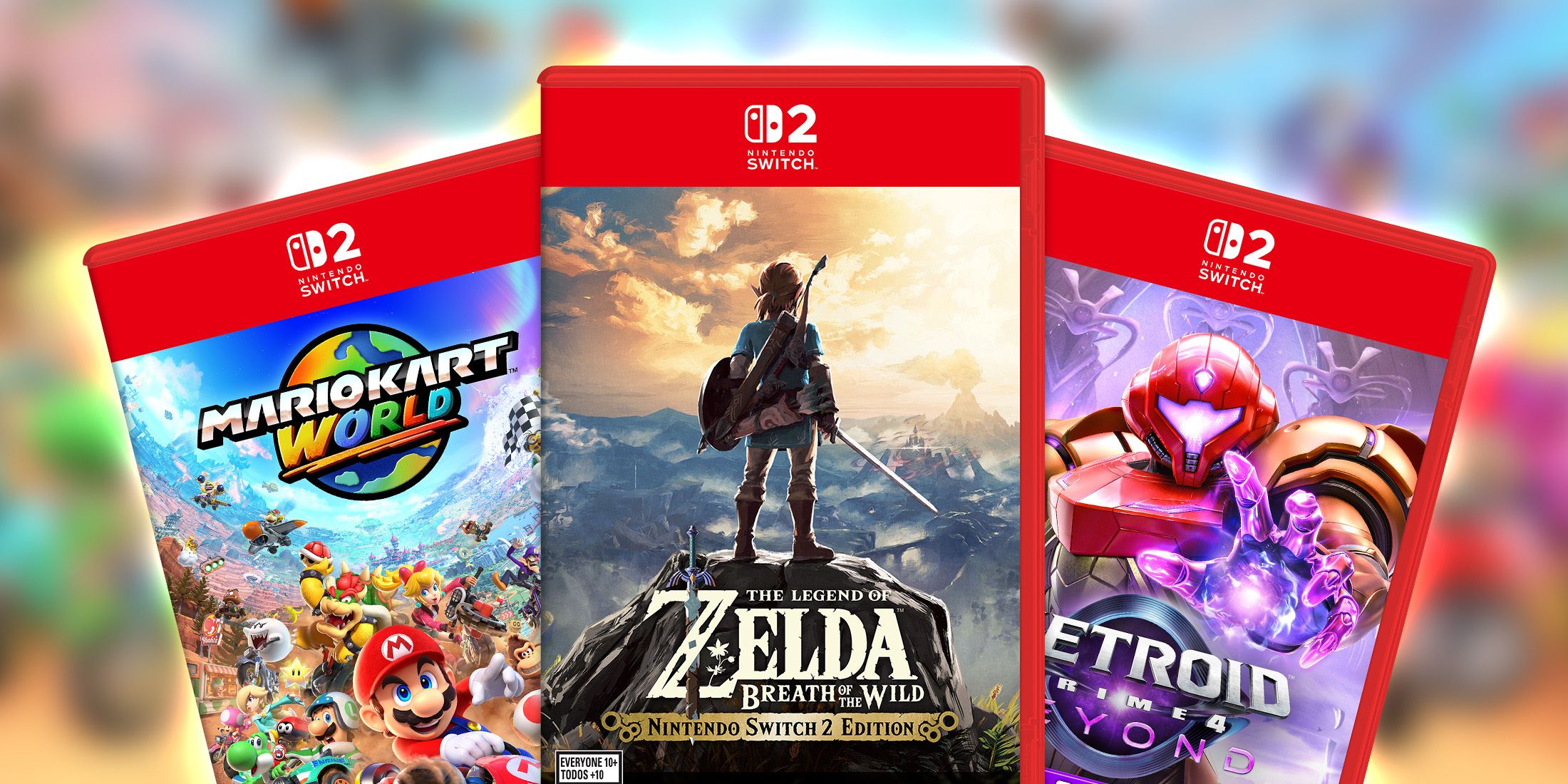
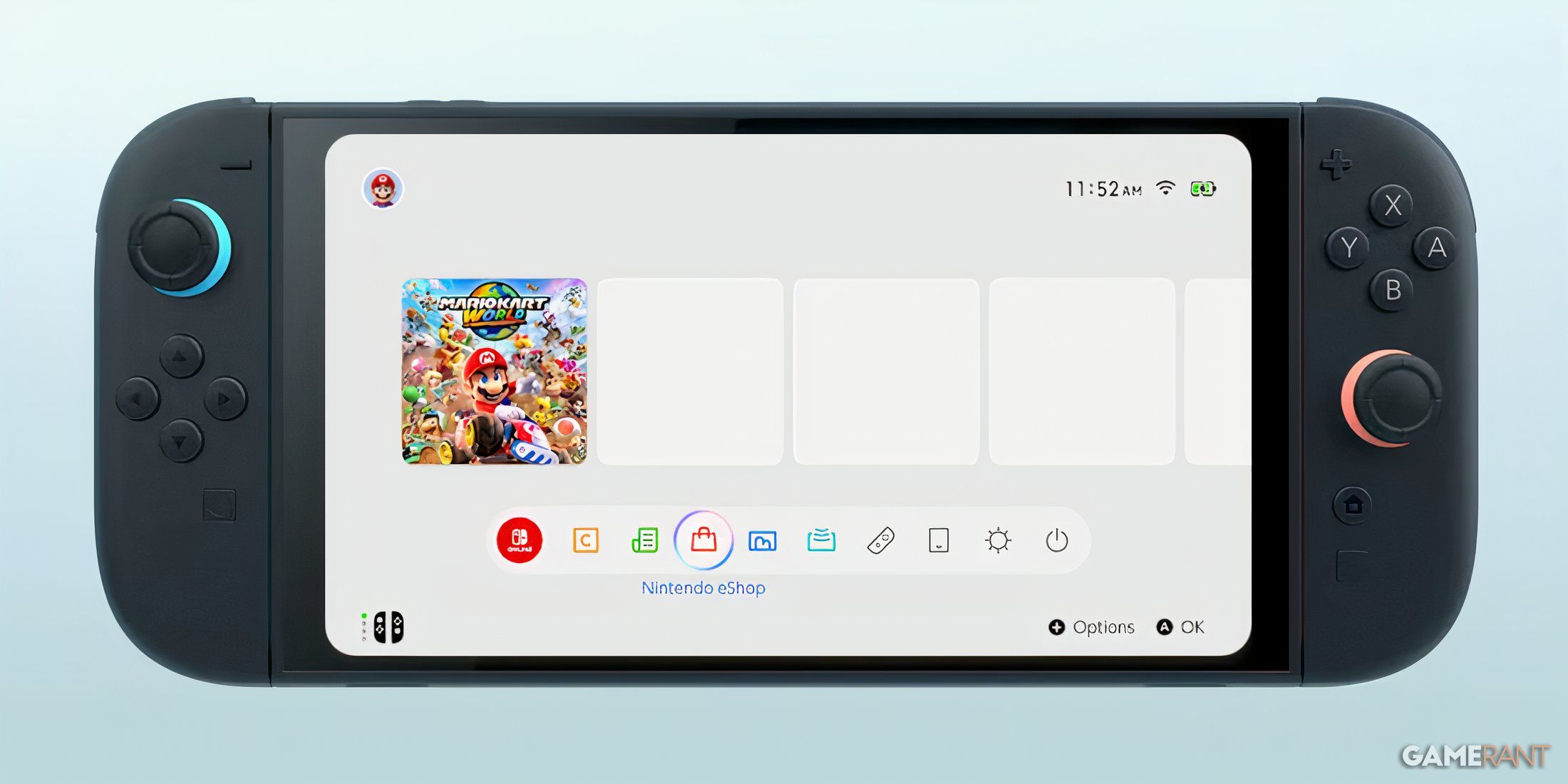
After the April 3 Nintendo Direct unveiled numerous details about the Switch 2, including its games, pricing, and more, sifting through these diverse disclosures left people surprised by an unexpected controversy: the unique design of the Switch 2’s game cases. It was later discovered that the Nintendo Switch 2 employs a distinct box art template from the original Switch, and debates regarding its quality have already emerged. Some find the new design acceptable, and it seems that the quality of the game art and logos remains unaffected; however, the change still appears jarring to many.
How Switch 2 Cover Art Rubs Some The Wrong Way
The primary debate revolves around a change in design: instead of a small square at the top-left corner with the Nintendo Switch logo (in red and white), the new Nintendo Switch 2 model features a wider, case-spanning red banner housing its logo centrally. Additionally, the game cases for the Switch 2 might utilize transparent red plastic on their edges instead of the light gray used for the original Switch 1. Consequently, this change results in the box art’s right and bottom edges having a prominent red border. While the borders may appear less stark when observing an actual Switch 2 game case as opposed to a 2D representation, the new banner is still noticeable.
Nintendo Switch 2 Box Banners Are Distracting For An Important Reason
There Should Be No Confusing Switch 1 and 2 Boxes
For decades, gaming cases have featured universal templates with banners on top (like PlayStation) or side (such as Nintendo DS), but the box art of the upcoming Switch 2 breaks this mold. Unlike other game boxes, its banner is unusually large, overpowering and encompassing a single game’s artwork, and extremely vibrant in color. While discussions about the Switch 2’s cover art might continue for some time, there’s a positive aspect to consider: this eye-catching design could boost the console’s popularity in the long term.
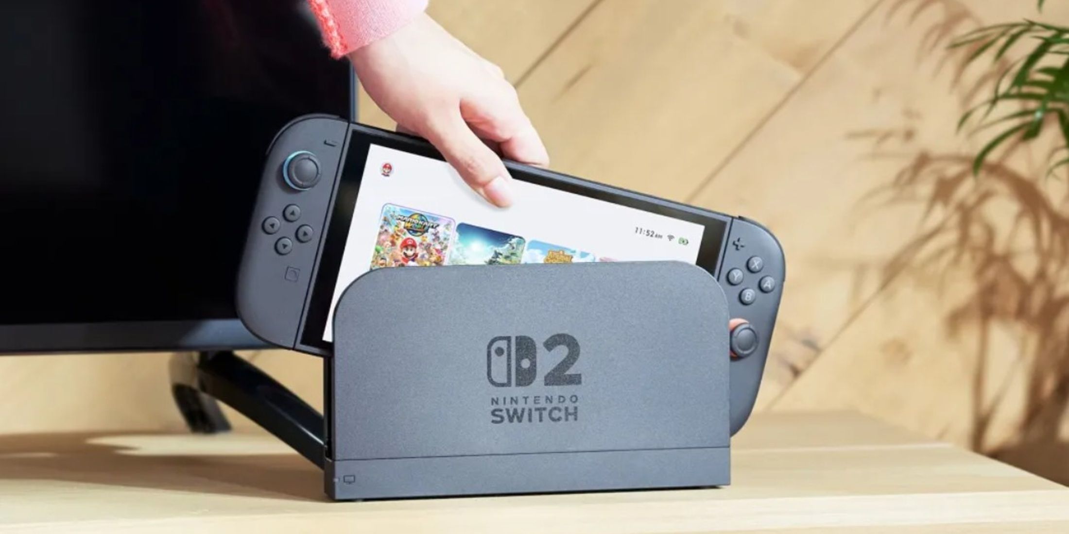
Due to a striking difference in design between the banner of the Nintendo Switch 2 and its predecessor, it may be challenging for consumers to distinguish them at first glance. This could lead to confusion during the transition from one console to another, as we saw with the shift from Wii to Wii U. Given that the two Switches share a similar name and appearance, it’s essential to maintain visual distinction between their game cases. This is particularly important because not every game on one Switch can be played on the other. Therefore, making the boxes look distinct serves Nintendo Switch 2’s best interests.
Read More
- All Skyblazer Armor Locations in Crimson Desert
- One Piece Chapter 1180 Release Date And Where To Read
- How to Get the Sunset Reed Armor Set and Hollow Visage Sword in Crimson Desert
- All Shadow Armor Locations in Crimson Desert
- All Golden Greed Armor Locations in Crimson Desert
- How to Beat Stonewalker Antiquum at the Gate of Truth in Crimson Desert
- Cassius Morten Armor Set Locations in Crimson Desert
- Grime 2 Map Unlock Guide: Find Seals & Fast Travel
- USD RUB PREDICTION
- Marni Laser Helm Location & Upgrade in Crimson Desert
2025-04-05 20:35