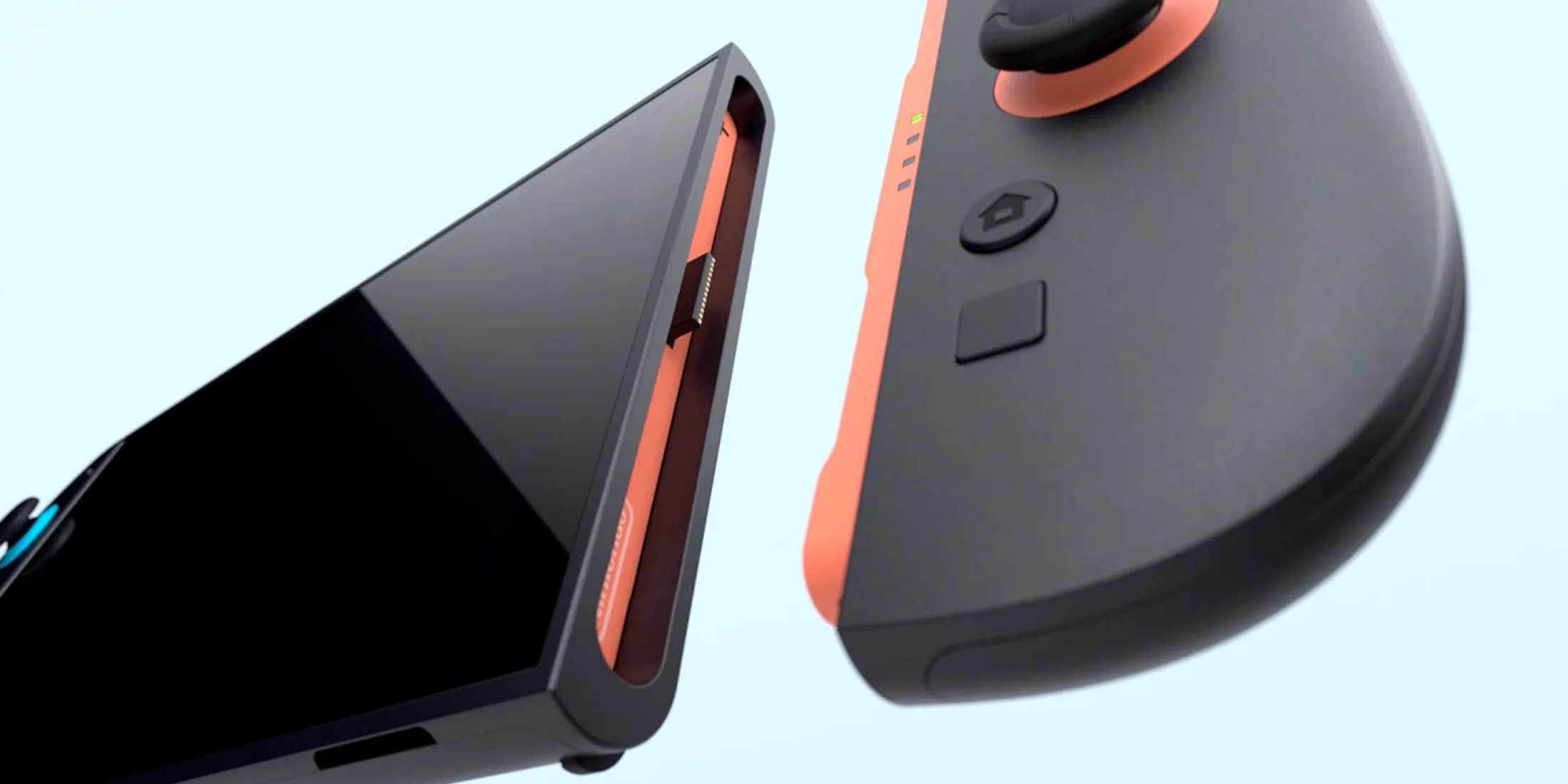
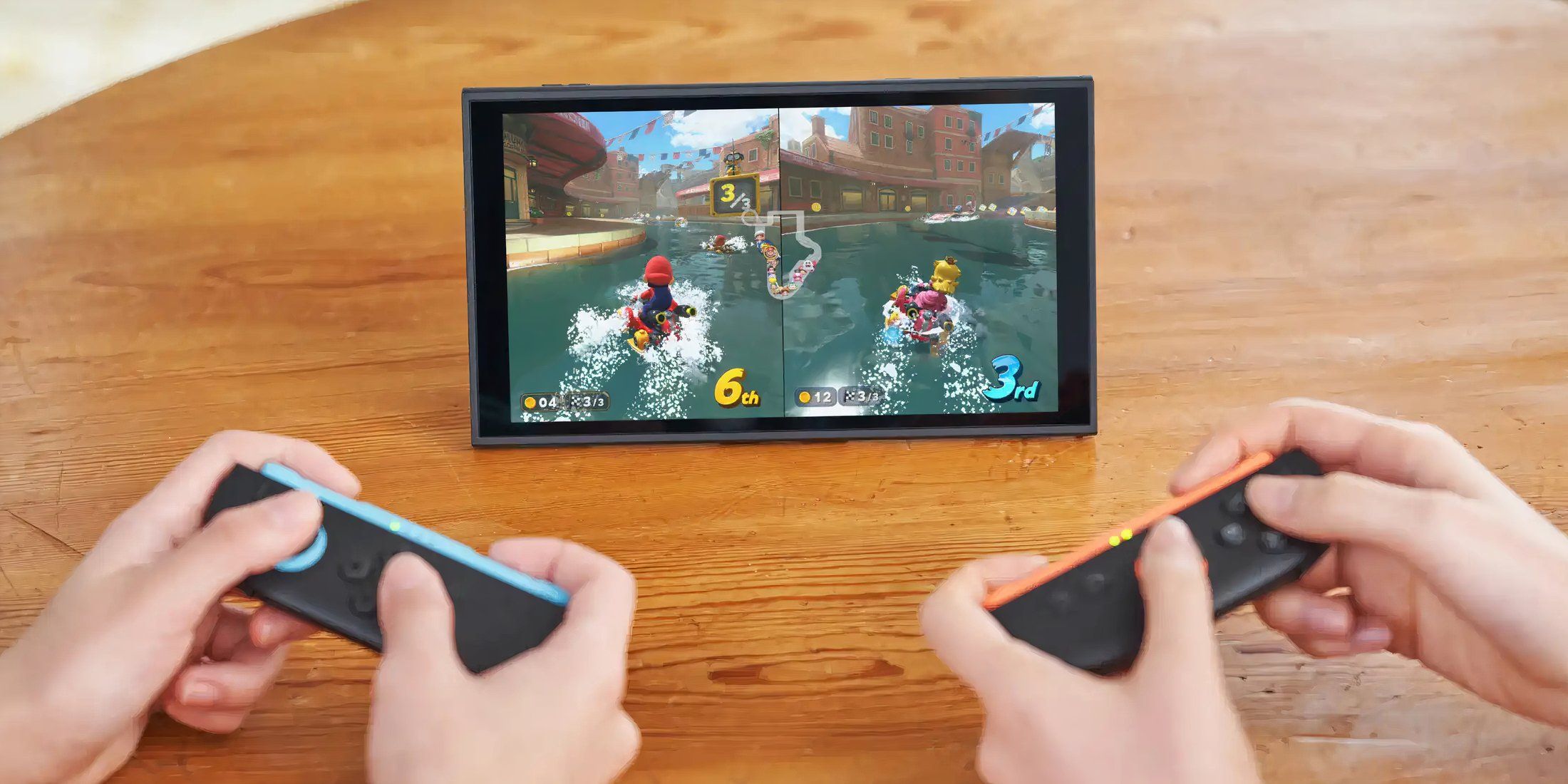
Nintendo’s upcoming console, the Nintendo Switch 2, showcased an abundance of thrilling new game titles in its recent presentation, ranging from the visually stunning Mario Kart World to the imaginatively designed Donkey Kong Bananza. However, it wasn’t just about games; the event also disclosed some significant updates regarding the console itself. Nintendo confirmed that the Switch 2 will debut with a set of appealing new features like GameChat, which enables users to chat with friends during gameplay, and GameShare, a function that permits sharing games among players for multiplayer sessions. The company also unveiled that the device will be equipped with native 4K resolution, 256 GB internal storage, and improved Joy-Con 2 controllers, which can function as computer mice.
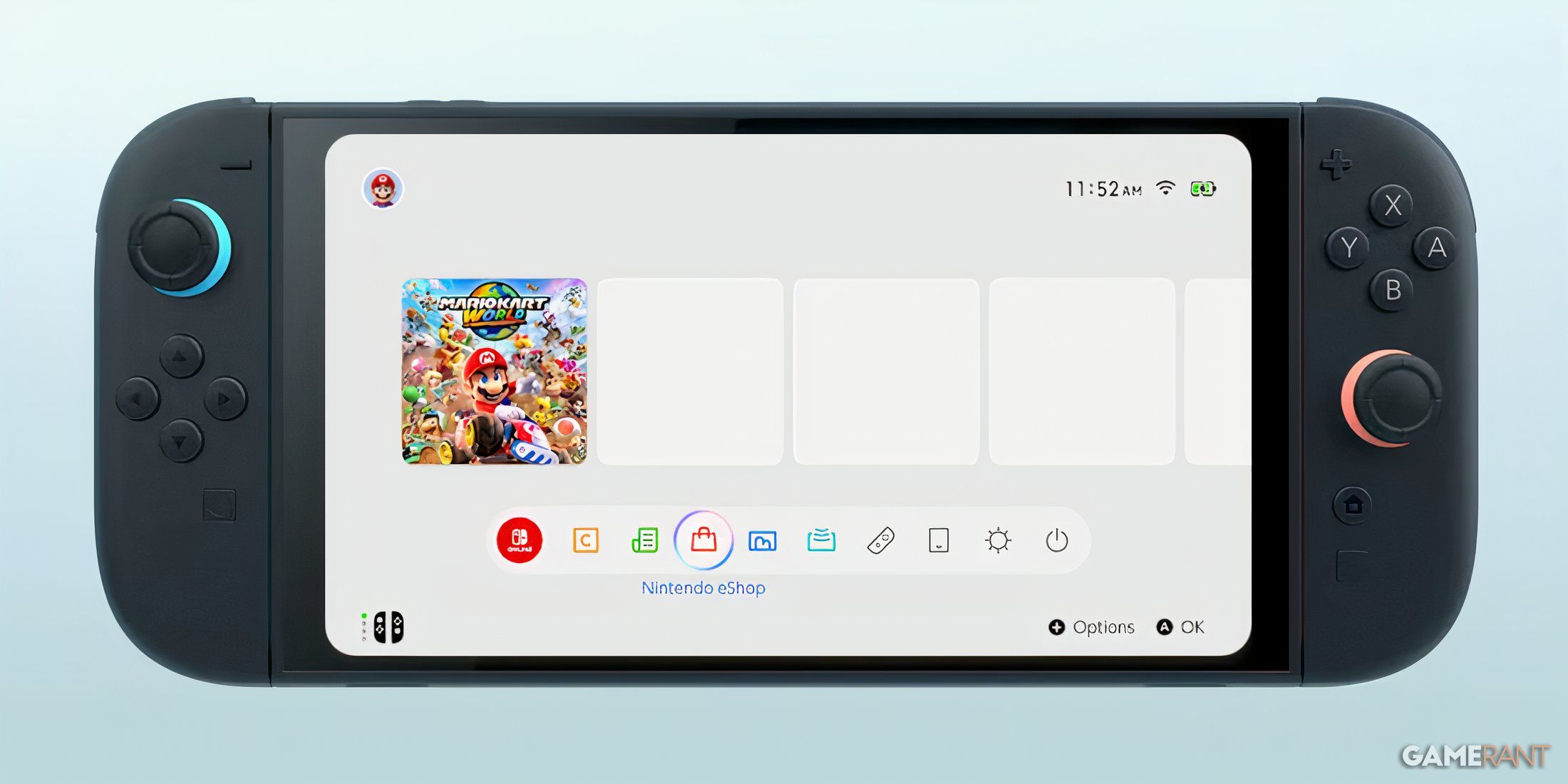
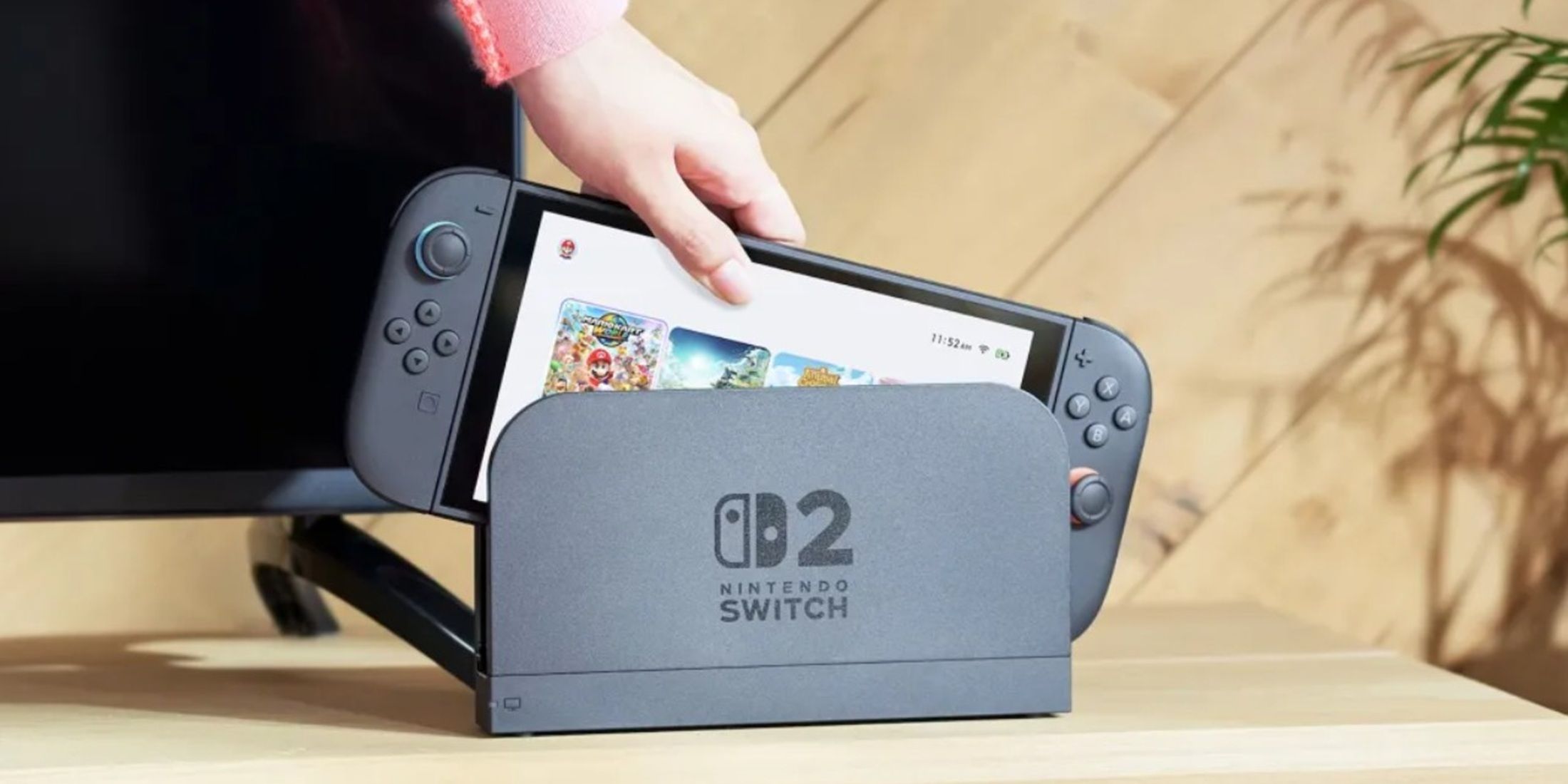
During the Nintendo Switch 2 presentation, they didn’t seem to spend much time discussing the console’s user interface (UI). Apart from some pictures and videos on their official website, there hasn’t been much footage of the new operating system available. Based on what we’ve seen so far, the UI looks quite similar to that of the original Switch. There are a few minor improvements here and there, but they don’t seem overly exciting at this point.
The Switch 2’s UI isn’t Different Enough from its Predecesor
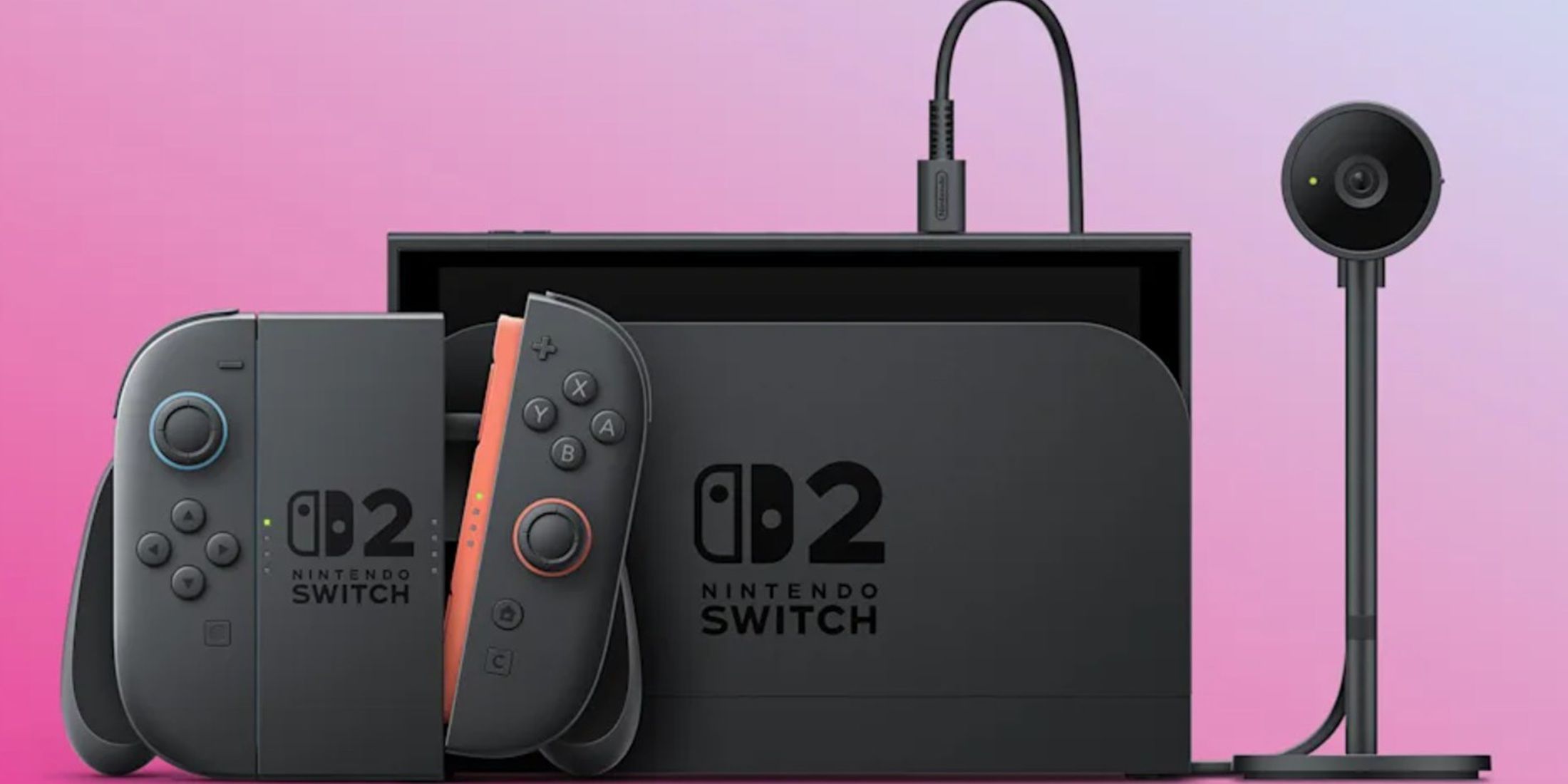
Nintendo Has Added Some New Features to the Home Menu for the Switch 2
On the home menu of the Nintendo Switch 2, you’ll find a few fresh additions such as a C Button that opens the Switch 2’s GameChat. Moreover, the Nintendo eShop performs noticeably better than on the initial Switch model. Furthermore, there are subtle aesthetic changes worth mentioning – for instance, the eShop icon now appears in red instead of orange on the taskbar, and the game library menu sports rounded edges rather than sharp ones, giving it a more streamlined look. Additionally, a Themes tab has been added to the settings menu, hinting at future customization options for the console’s home screen. Although this feature hasn’t yet been fully detailed, we should keep our enthusiasm in check until official details are confirmed.
The Switch 2’s UI is Indicative of Nintendo’s Vision for the Console
The design for the upcoming Nintendo Switch 2 appears to be an improvement upon the initial design, rather than a radical overhaul. Unlike some previous Nintendo consoles that introduced groundbreaking features, the Switch 2 seems to focus more on enhancing the original’s attributes. It doesn’t introduce any revolutionary new functions, but it does carry forward the essential elements of the base Switch. Consequently, the main advantage of the Switch 2 lies not in its unique features, but rather its ability to accommodate higher-quality video games.
The UI For the Switch 2 Feels Like It’s Missing the Soul of Prior Nintendo Consoles
While the user interface (UI) of the Switch 2 appears acceptable, its lack of novelty is rather disheartening, given Nintendo’s historic reputation for embedding charm and creativity within their console operating systems. Compared to earlier models like the Wii, the Nintendo DSi, the Nintendo 3DS, and even the Wii U, these platforms showcased unique UI designs, pre-installed applications that utilized their specific features such as touch screens or cameras, and even distinct menu music that left a lasting impact. For instance, the Wii Shop Channel’s music gained popularity and even became a meme.
It appears that the user interface (UI) of the Switch 2 may lack the distinctive elements that set apart Nintendo’s classic systems. Instead, it seems to focus on ease-of-use and simplicity rather than innovation and charm, much like the original Switch. While this decision can be justified given that the Switch 2 is an upgrade rather than a new type of console, it might still feel disappointing. At this stage, the launch of the Switch 2 could potentially mark the end of unique UI designs for Nintendo consoles.
Read More
- All Skyblazer Armor Locations in Crimson Desert
- One Piece Chapter 1180 Release Date And Where To Read
- How to Get the Sunset Reed Armor Set and Hollow Visage Sword in Crimson Desert
- All Shadow Armor Locations in Crimson Desert
- All Golden Greed Armor Locations in Crimson Desert
- How to Beat Stonewalker Antiquum at the Gate of Truth in Crimson Desert
- Cassius Morten Armor Set Locations in Crimson Desert
- Grime 2 Map Unlock Guide: Find Seals & Fast Travel
- USD RUB PREDICTION
- Marni Laser Helm Location & Upgrade in Crimson Desert
2025-04-05 19:34