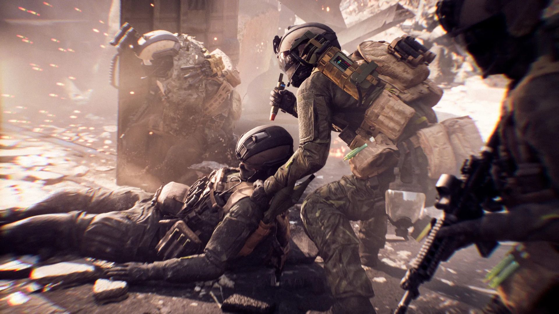
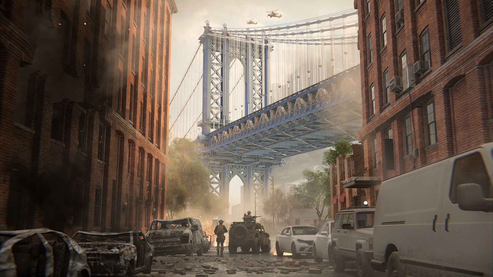
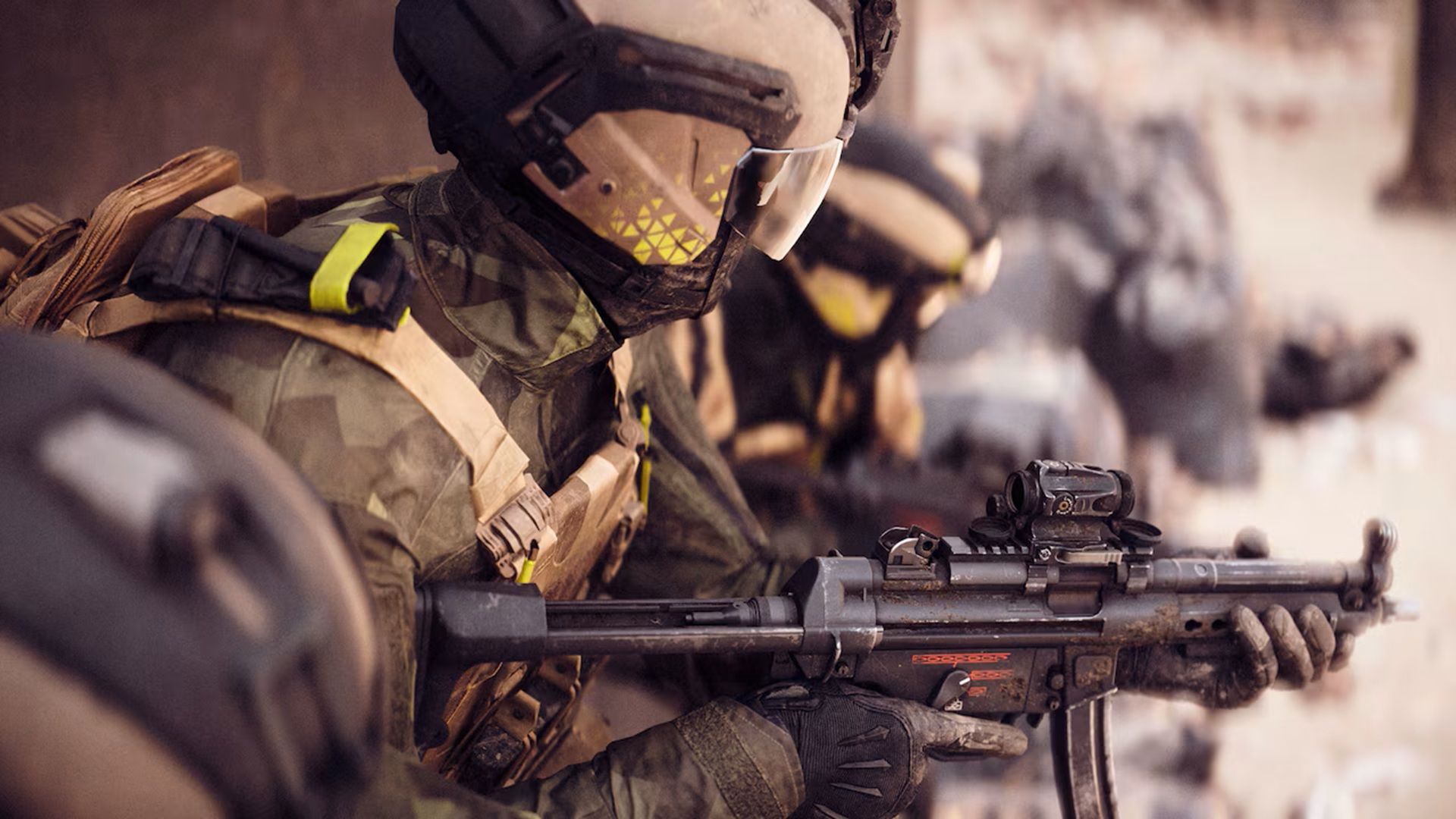
The highly anticipated Battlefield 6 has arrived, and its launch weekend is proving to be incredibly successful for the series. While the recent Battlefield 6 Open Beta saw a massive number of players on Steam, the full game’s launch is exceeding expectations.
I was blown away when I heard that over 700,000 people were playing *Battlefield 6* on Steam within the first hour! It’s been highly anticipated, but honestly, the launch hasn’t been perfect. People are complaining about the maps being a little small and the wait times to get into servers are pretty long. But the biggest issue for me, and a lot of other players it seems, is the user interface. It’s just… confusing. It feels like we’re seeing the same UI problems that *Call of Duty* has struggled with for years, which is really frustrating.
Battlefield 6’s UI Design Has Left Players Feeling Frustrated

- Battlefield 6 players are criticizing the game’s UI design.
- Much of the criticism stems from confusing menu screens and layout.
- The Call of Duty franchise has ignited similar UI complaints over the years.
Immediately after the release of *Battlefield 6*, many players expressed their frustration with the game’s user interface (UI) on social media. One Reddit user, PuzzledScratch9160, called it “the worst UI experience in any game” they’d ever encountered. Numerous other players appear to share this opinion, as the post quickly gained over 13,000 upvotes.
Players have consistently criticized the user interface (UI) in *Call of Duty* games. This criticism recently spiked when advertisements were added to the UIs of *Black Ops 6* and *Warzone*. The negative reaction was strong enough that Activision removed the ads, claiming they were mistakenly published as a test. For about ten years, many players have felt that each new *Call of Duty* game has an unnecessarily complicated UI, and it appears that *Battlefield 6* is facing similar issues.
Battlefield 6 has already raked in $100 million just from Steam sales.
Battlefield 6 Continues an Unfortunate UI Trend
One frustrating aspect of *Battlefield 6* is how you have to scroll sideways to find different game modes. While this isn’t a new design choice – games like *Fortnite* also use it – many players, like one Reddit user, find it confusing and not user-friendly. Streaming services such as Netflix and Hulu have used this type of scrolling for years, and it works well for browsing movies and shows. However, in a game like *Battlefield 6*, the menus need to display a lot more information, making the side-scrolling feel overwhelming. Since choosing a mode is a big part of the *Battlefield 6* experience, it’s disappointing that finding one can be more of a hassle than it should be.
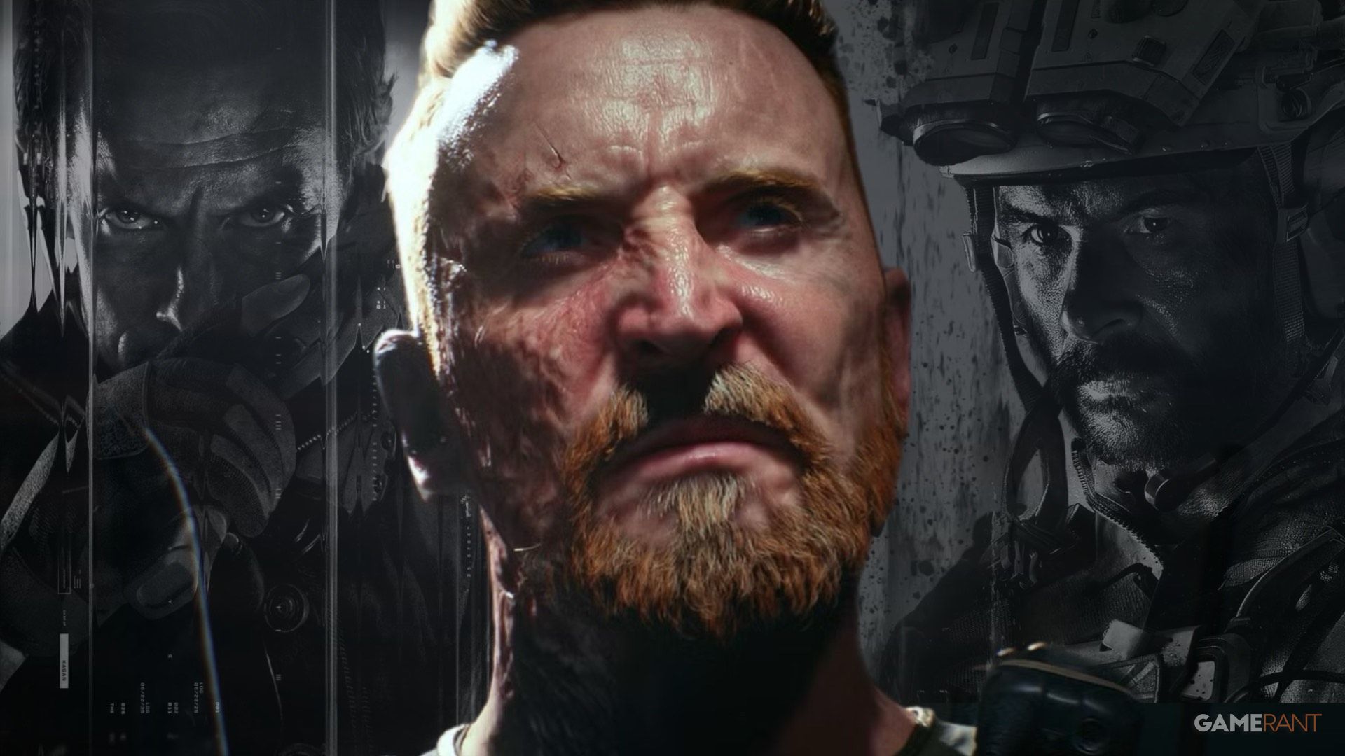
Battlefield 6 and Call of Duty Are Set for an End-of-Year Showdown
As the release of *Call of Duty: Black Ops 7* approaches, it will be worth watching how the game handles its user interface. Even though *Battlefield 6* had some UI issues, it’s looking like *Black Ops 7*’s main rival. While menu design won’t make or break the competition, both games might be making their interfaces more complicated than they need to be.
Black Ops 7 launches on November 14.
The user interface in *Battlefield 6* probably won’t be updated. While some players don’t like how it looks right now, the good news is that the actual gameplay is much more fun than navigating the menus.
Read More
- Robinhood’s $75M OpenAI Bet: Retail Access or Legal Minefield?
- All Skyblazer Armor Locations in Crimson Desert
- How to Get the Sunset Reed Armor Set and Hollow Visage Sword in Crimson Desert
- How to Catch All Itzaland Bugs in Infinity Nikki
- All Hauntingham’s Letters & Hidden Page in New Super Lucky’s Tale
- Speedsters Sandbox Roblox Codes
- Who Can You Romance In GreedFall 2: The Dying World?
- Black Sun Shield Location In Crimson Desert (Buried Treasure Quest)
- Invincible: 10 Strongest Viltrumites in Season 4, Ranked
- Top 10 Must-Watch Isekai Anime on Crunchyroll Revealed!
2025-10-11 19:04